

AstraZeneca is a multinational pharmaceutical and biopharmaceutical company. Astrazeneca had the need to improve their brand’s presence in a mobile format since the traffic to its brand sites from mobile devices had risen 200-300% surpassing desktop traffic.
SeroquelXR (one of Astrazeneca's products) needed to optimize its mobile website experience so users could easily access information to learn more about SeraquelXR, as well as using the SXR savings card from their mobiles.
I was responsible for all aspects of the UX process and visual design.
Team: Senior Digital Project Management, Director of User Experience, Senior Engineer, Head of Digital, Account Direction, Account Strategy, Copywriter, and stakeholders.
Location: Remote, NY

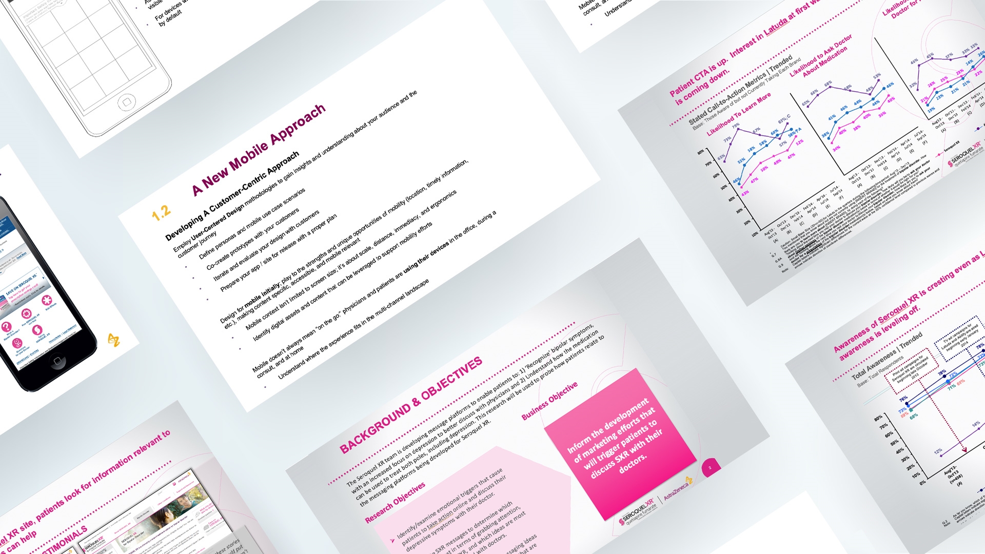
To understand the competitors landscape and how users interact with pharmaceutical and mental health. I learned as much as I could about SeraquelXR, the competitors, the users struggles and their goals. I synthesized the research and highlighted the most important aspects, including stakeholders feedback.
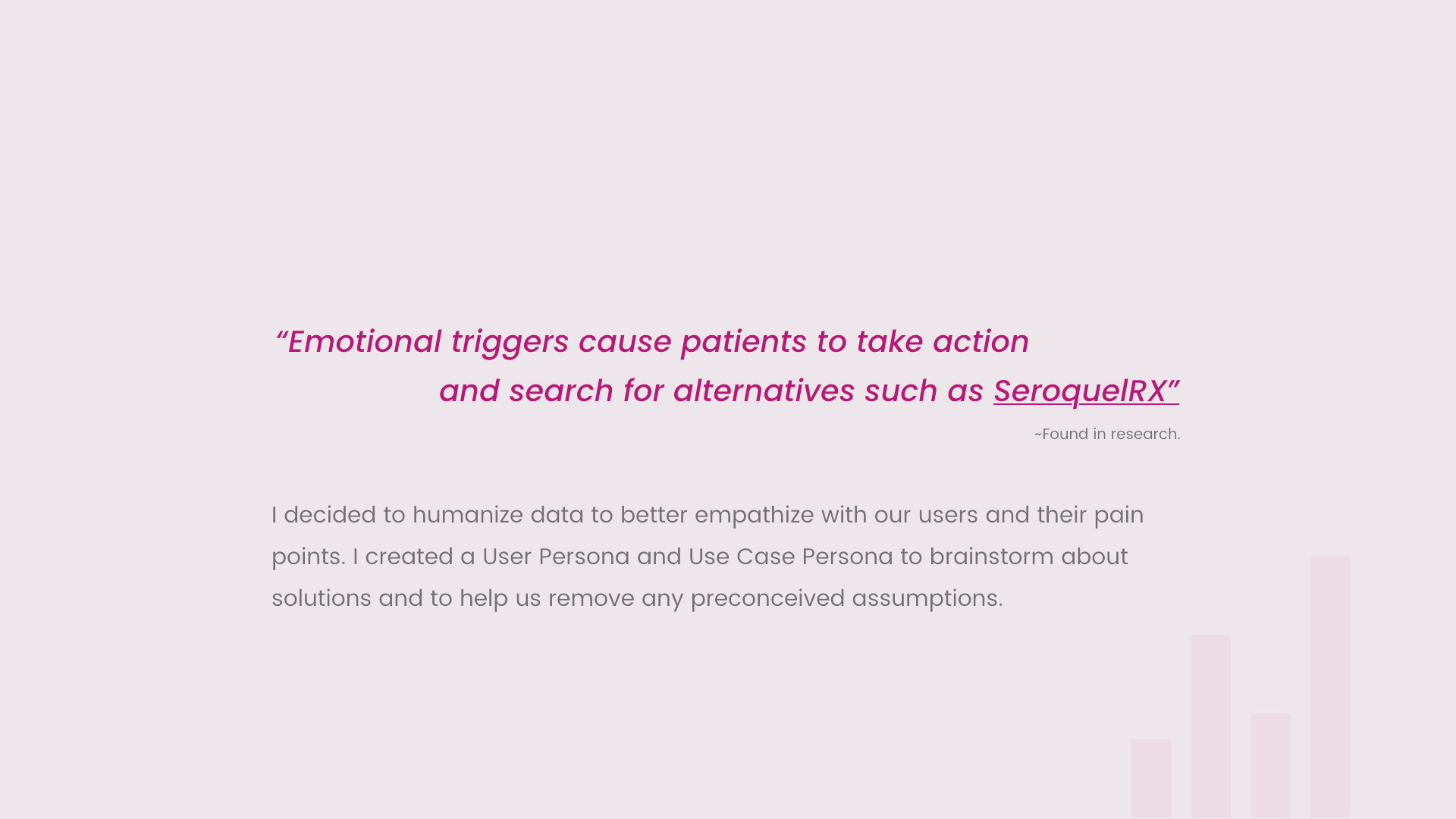
I decided to humanize data to better empathize with our user’s perspective. I created a User Persona to brainstorm about solutions and to help remove any preconceived assumptions.
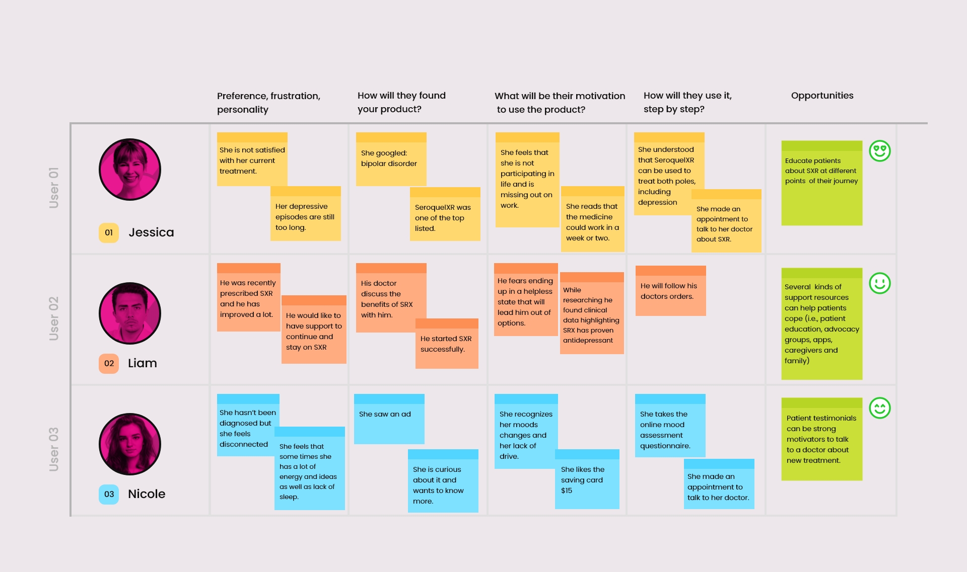
I needed to understand our users and their expectations with our product. Based on the provided research by marketing; I created 3 users personas.

Jessica is not currently prescribed SXR. She was diagnosed and is dissatisfied with her current treatment for her depressive episodes associated with bipolar disorder and MDD. She fears that her depression is coming back. She wants to learn more about SRX.

Liam was diagnosed recently and was prescribed SeroquelXR . He seeks support to start and stay on SXR. He has a lot of expectations as well as being optimistic about SXR and he feels motivated.

Nicole is not diagnosed, however she has noticed her mood swings and she was able to relate to patients testimonials online. She wants to take the mood assessment questionnaire and be prepared to make an appointment with her doctor to discuss SXR as a treatment option.
I created the site map after the final content was selected by working with copywriter and stakeholders.
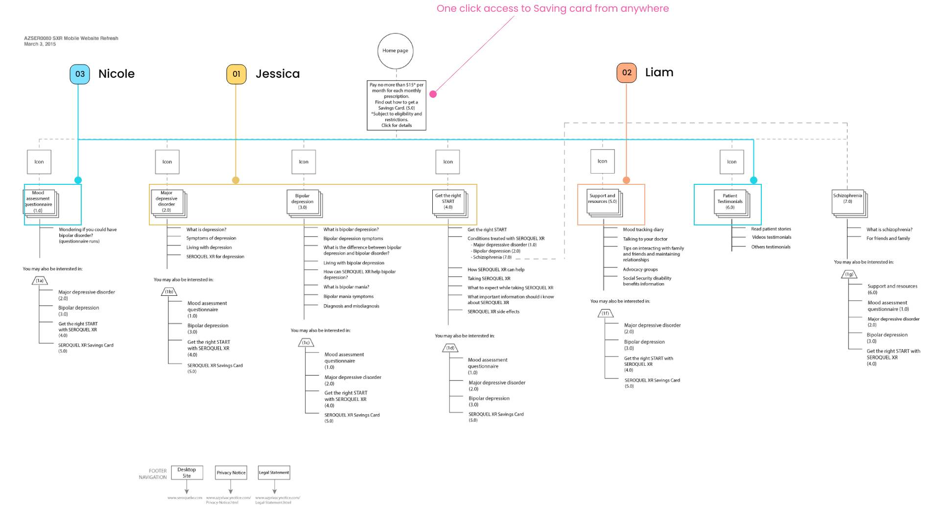
From the User Case Persona, I was able to brainstorm about the opportunities and where to prioritize main solutions in the Home page for each user persona.

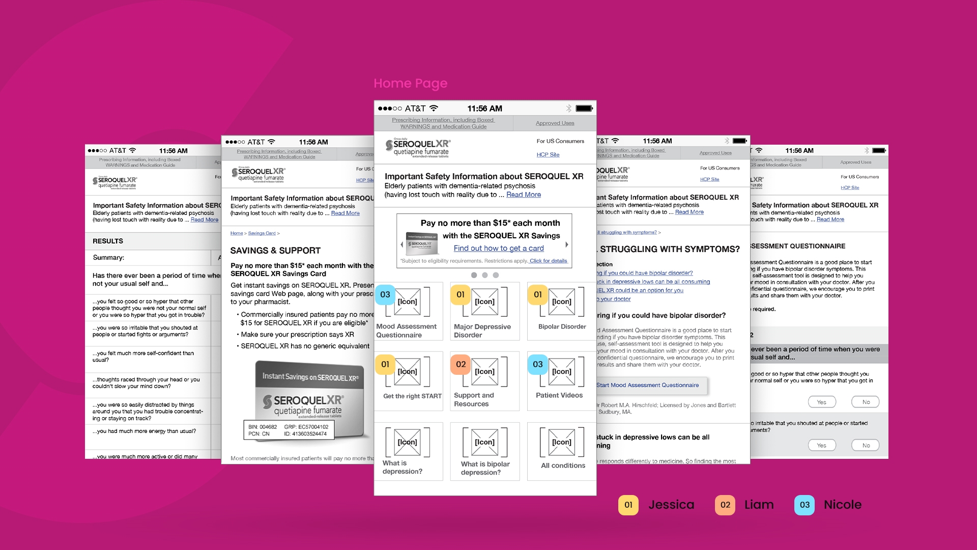
I established the visual language, keeping consistency with the SeroquelXR brand. I designed custom icons that clearly communicate each solution in the most empathic way. I created high fidelity screens for stakeholders feedback.
Empathy Icon design
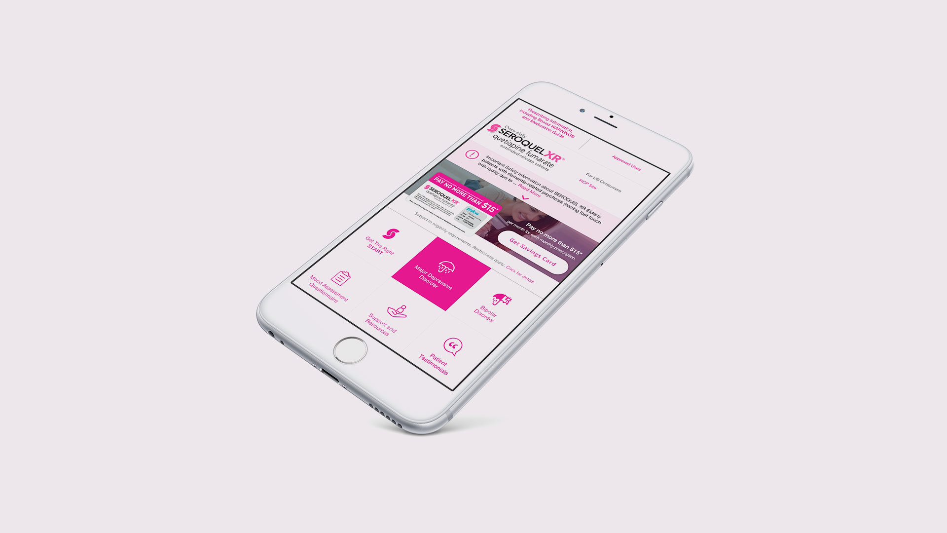
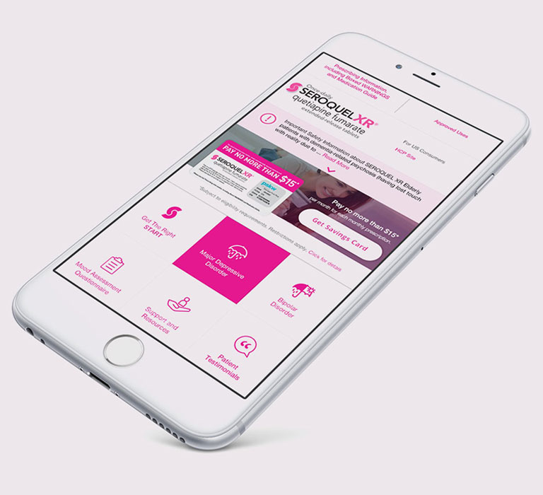
I used a color palette that feels calm but at the same time cheerful! I created a clean UI removing distractions and focusing on the content, the key message, and the most important actions.
I focused my designs on the emotional connection with the users. The hero images were an invitation to superimpose their own stories of how they felt when they were in similar situations.
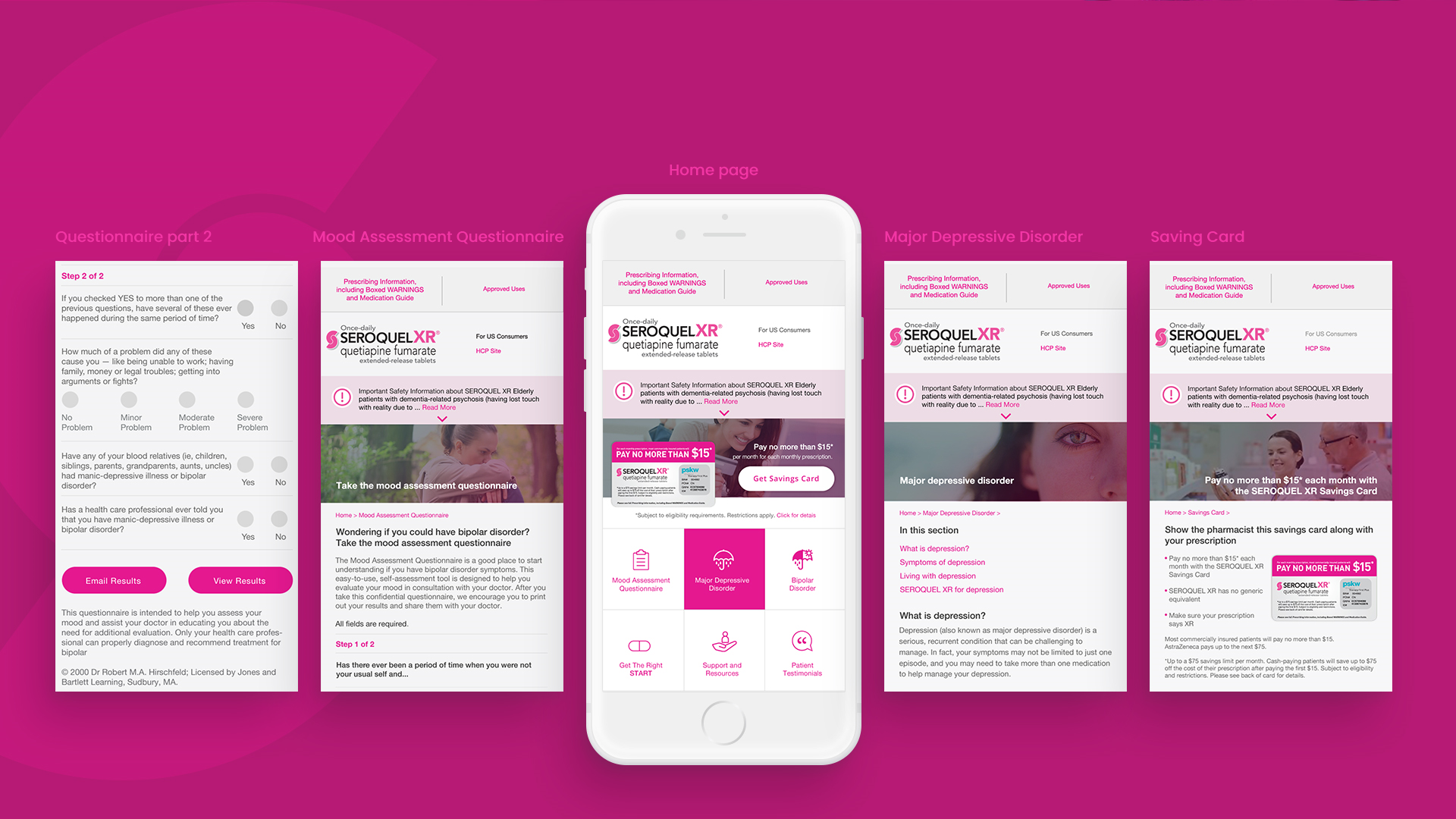
The final UI design solution and presentation was well received and the next step was to prepare files for development.
This was an incredible opportunity for me. It was the first time I combined marketing research and user personas. I learned the importance of personas to increase my level of empathy and my ability to understand pain points.
In retrospective I would have liked to be able to perform a usability testing to validate my design decisions and learn more.